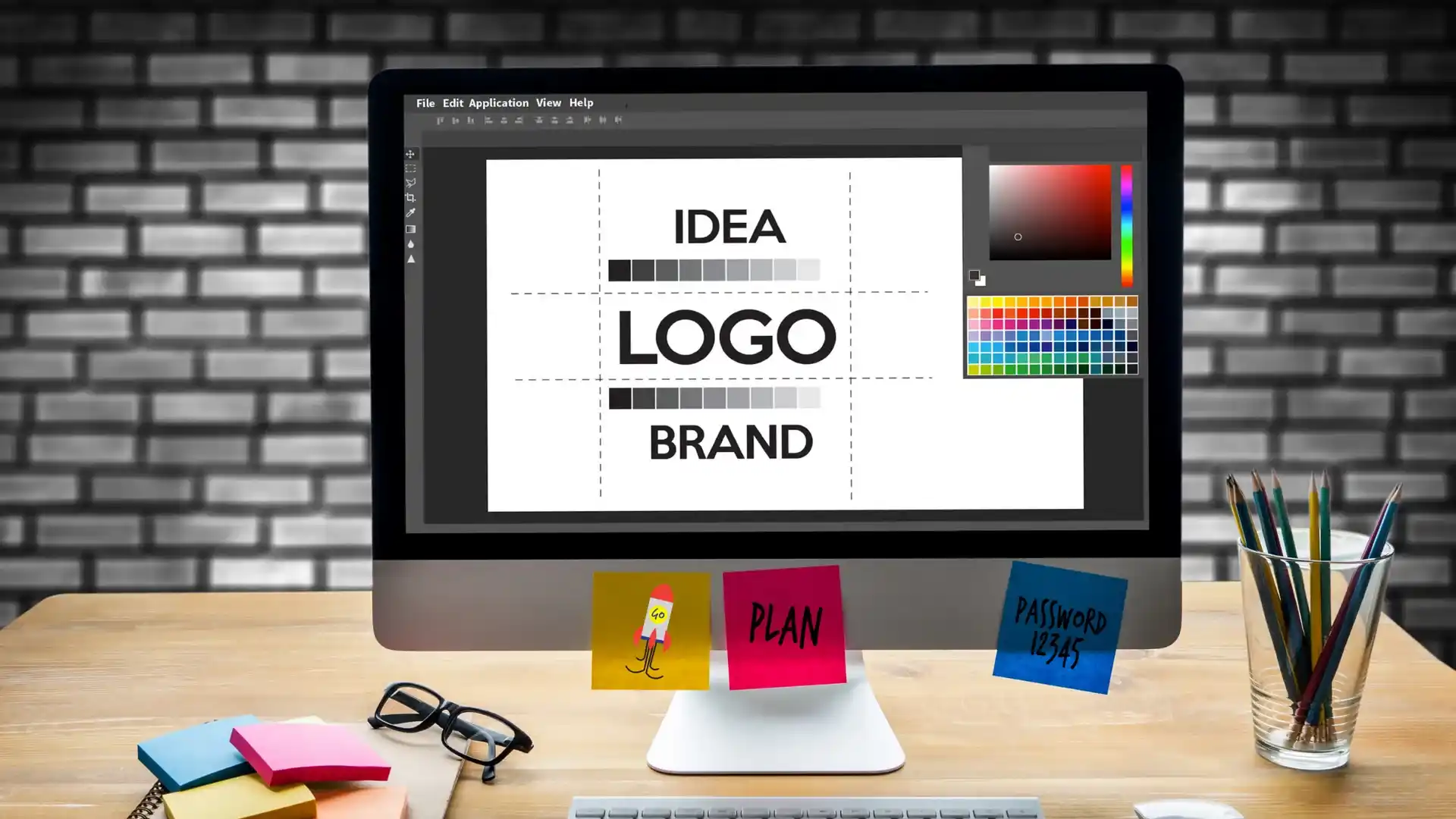
Your logo is the visual cornerstone of your brand, and its font plays a huge role in shaping how people perceive your business. Fonts convey tone, personality, and professionalism. But just like trends in fashion, design, or technology, font styles evolve over time. This raises an important question: When should you update your logo fonts? The answer isn’t one-size-fits-all, but there are some clear indicators that it might be time for a refresh.
Your Font Looks Outdated
Fonts, like all design elements, go through cycles of popularity. A typeface that looked modern and cutting-edge ten years ago may now feel stale or passé. For instance, heavily stylized fonts from the early 2000s or ultra-minimalist sans-serifs from the 2010s might not resonate with today’s audience. If your font is no longer aligned with current aesthetics or worse, feels like a relic of the past, it’s worth considering an update.
Rebranding or Brand Evolution
If your company is undergoing a rebrand or shifting its target market, it’s a perfect time to assess your logo font. A youthful, quirky font might have suited your brand in its early days, but if you’ve matured into a more premium or corporate space, the typeface should reflect that. Fonts help communicate your values and tone, so make sure they align with your new identity.
Inconsistency Across Platforms
As digital media continues to dominate, a logo must perform well across many different platforms: web, mobile, print, and even merchandise. A font that’s overly ornate or difficult to read at small sizes might not translate well on mobile screens or social media avatars. If you’re finding that your current logo font struggles to remain legible or scalable, it’s a good time to look into a more versatile option.
Expansion into Global Markets
If your brand is going international, you might need a font that supports multiple languages or character sets. Some fonts don’t include special characters, diacritics, or support for non-Latin alphabets, which can be a major limitation. In these cases, updating to a more inclusive and globally-friendly typeface is not just a design choice, it’s a necessity.
Brand Perception Has Shifted
Maybe your brand has earned a new reputation organically, whether that’s becoming more professional, more eco-conscious, more tech-savvy, or more niche. If your logo font doesn’t align with how your audience now sees you (or how you want to be seen), it might be time for a change. Fonts help form first impressions; make sure your logo’s typography supports the narrative you’re trying to tell.
It’s Too Similar to Competitors
Brand differentiation is key in a crowded market. If your logo font closely resembles those of your competitors, customers may have trouble remembering or recognizing you. Even subtle changes in font weight, spacing, or style can help carve out a unique visual identity. Conduct a brand audit and see how your font stacks up against others in your industry.
Poor Performance in Testing
Sometimes, feedback reveals the truth. If your customers, stakeholders, or user testing indicate that your logo is hard to read, unappealing, or confusing, take it seriously. Font choices are deeply psychological, they can evoke trust, innovation, luxury, or fun. Use A/B testing or brand perception surveys to determine whether your current font is doing its job.
Conclusion
Updating your logo font doesn’t mean losing your identity, it means evolving with intention. Fonts are powerful tools in shaping how people connect with your brand, and staying current shows you’re in tune with your audience. Whether it’s a subtle refinement or a bold overhaul, refreshing your logo font at the right time can breathe new life into your brand and set the tone for your next chapter.